In November 2014 and September 2015 we published 2 articles on the series Fee & Fonske (Bouboule & Noiraud in French). The series was published between 1949 and 1951 in Ons Volkske under the name “De Fratsen van Fee en Fonske” and “De avonturen van Mieleke en Dolf” and would also appear in both Kuifje Weekblad and Journal Tintin as Bouboule & Noiraud.
For those who didn’t know, Fee (Bouboule) is the small obese boy, Fonske (Noiraud) is the tall boy and they are as BD Must correctly says the cousins of Quick & Flupke.
Up until now these gags were only available in the issues of said magazines and in a fan made collection which wasn’t widely spread, we talk about the one Jean-Pierre Verheylewegen made in 2001/2002. But also this publication didn’t include all of the strips ever published.
For the first time in album format
BD Must has now published the gags that appeared in both Journal Tintin and in Kuifje Weekblad. We name both magazines as the gags were not 100% identical so if you want all of the gags that were released in both magazines, you better order both. And, good to know, this is not the complete series either, because there are some that appeared in Ons Volkse and not in the aforementioned magazines.
Yes, all very complex, but we have good hope that these will be released in the future, even if it takes 5 more years. But let’s already rejoice as BD Must presents us 2 publications of 16 pages each.
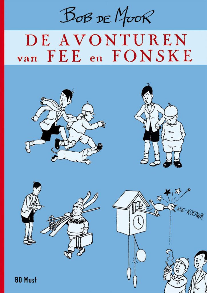
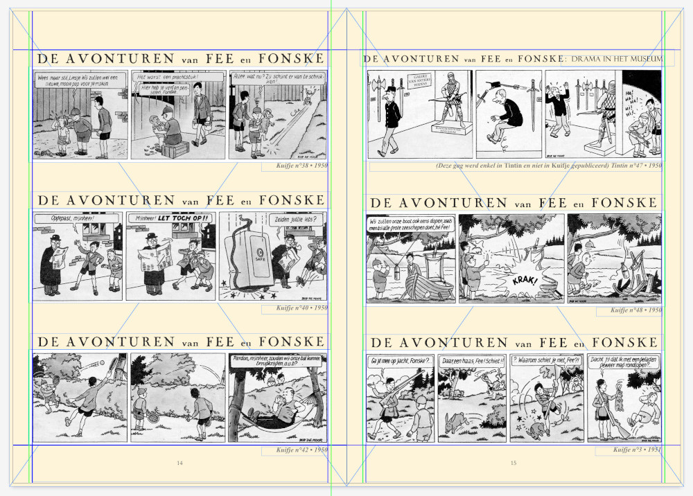
The first publication is “De Avonturen van Fee en Fonske”, in dutch and offering all of the “Fee en Fonske” gags which were published between 1949 and 1951 in Kuifje Weekblad. The paperback format (21 x 30 cm) comes in a limited edition of 300 numbered copies. This has just been released and can be ordered via the better comic stores or directly via BD Must.
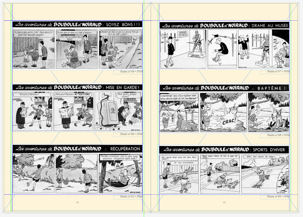
The second is called “Bouboule et Noiraud” and was already released in March via BD Must, but still available. It holds the 45 gags that were published in Journal Tintin between 1949 and 1951. The paperback format (21 x 30 cm) equally comes in a limited edition of 300 numbered copies.
From old magazines over cleaned scans to new albums
Jean-Michel Boxus from BD Must was so kind to talk to us and guide us through the preparatory work when they started working on the restoration and layout of the 2 publications. It’s an interesting walk through memory lane…
The first is a scan as it appeared in Journal Tintin.
Next you see how the scan was cleaned to keep only the separate cases and a white border is added around the cases. The same happens with the text in dutch. Then you have the layout in French and dutch where you can see a few differences: the gag from Journal Tintin nr 47 from 1950 does not exist in the Kuifje Weekblad and actually never was published in dutch. Another detail is that not all of the gags in dutch have a title whereas this is the case in French. “Drama in het museum” for instance is a translation made by David Steenhuyse. The Kuifje Weekblad nr 49 from 1950 equally did not have an episode.
Jean-Michel Boxus: “You see that the gags that appeared in Tintin / Kuifje are more like Quick and Flupke, most probably to bring them closer to Tintin’s Hergean graphic style. Noiraud now has black hair and Bouboule has a cap that does not exist in the version published in Ons Volkske. We also see that Bob signed with his full name: Bob De Moor.“
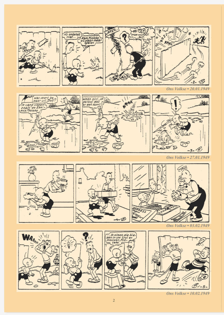
Jean-Michel Boxus: “Next to that there are all the gags that have appeared in Ons Volkske that I hope to publish one day, but I’m still missing a few… In Ons Volkse the series is called “Mieleke en Dolf” and Bob signed with just a “B”. The design is also a little more relaxed, less neat but with more expressive movements (a little more à la Spirou or à la Disney). Bob really had to adapt his style for the publication in Tintin / Kuifje this to make his drawing closer to that of Hergé, more polished, closer to Quick & Flupke, with more characters. stiff and less expressive.”
Different series, similar styles, similar characters
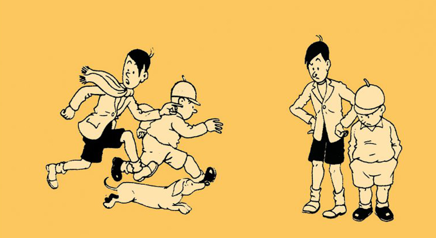
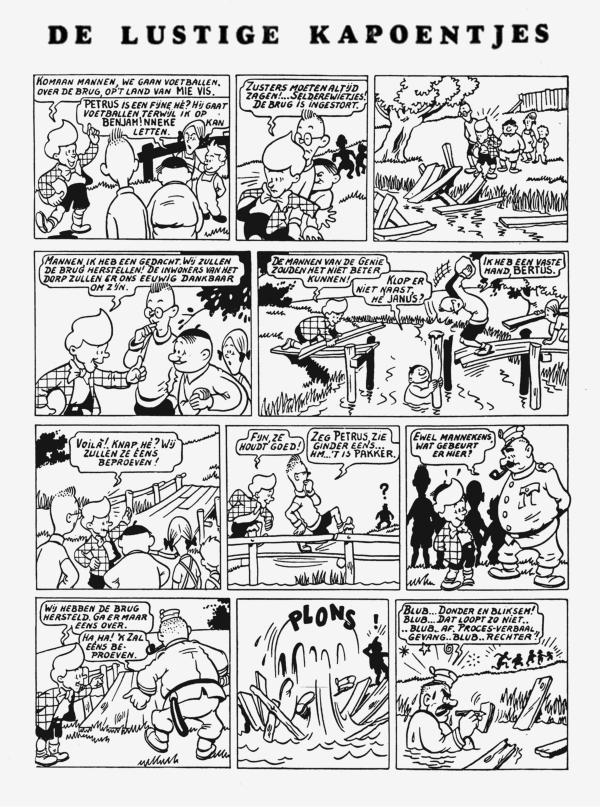
Fans will also notice that the drawings in Ons Volkske are very similar to those that Bob De Moor used for ‘De lustige kapoentjes’, they are in fact almost copies of some of the characters which is not a surprise, De Moor was working on so many series after all.
Below are 3 examples, the first is from ‘Mieleke & Dolf’, the second from ‘De lustige kapoentjes’ – where you can even recognize De Rosse popping up – the third image below is from ‘De Rosse’.
From Dolf to Fonske
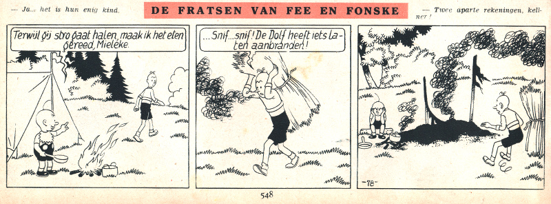
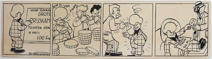
We mentioned it before, but “Fee & Fonske” was indeed once called “Mieleke & Dolf”. Bob De Moor didn’t pay much attention to the difference as he himself even mixed the names. In the example below you can see that despite the fact that the series is called “De Fratsen van Fee en Fonske”, the names used in the gag are Mieleke en Dolf.
So why did he drop those older names? ‘Dolf’ might have had a negative connotation (it’s short for Adolf) and maybe he changed the name in dutch for that reason. But it might also just be a coincidence. We’ll never know.