
In 1950, Karel Van Milleghem, the energetic editor-in-chief of Kuifje, the Flemish (dutch written) version of the Tintin weekly, asked Bob De Moor to adapt the Constant de Kinder novel “De wonderlijke lotgevallen van Jan zonder Vrees” into a comic. Due to the fact that the royalties asked for the Constant de Kinder original were a bit on the high end, it was suggested that De Moor would change the title of the story into “Sterke Jan”. The story also got published in Ons Volkske (issues 31 1951 through 14 1952), so that Tintin/Kuifje got the premiere.
In order to avoid accusations of plagiarism De Moor had to be rather inventive as far as the storyline went. As a result, the story itself was not really his best – with too many deus ex machina’s for example – and it was cut short after 36 pages (issues 1 through 36 of Tintin/Kuifje in 1951). But, though the scenario was far from excellent, De Moor had been able showcasing his graphical skills, yet again, including 2 of the best Tintin weekly covers for that year.
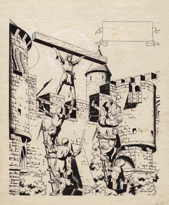
Just like most of De Moor’s albums, this story, too, got several front page layouts once it was released in an album format (more than 20 years later that would be). Although there are several more publications (including a great, very limited one by Pirrewiet a few years ago on 250 copies in an extra large format), we’ll only touch on the most known. The Magnum-version remained loyal to the original Tintin front page of issue 1, 1951, but both the Brabantia Nostra and the Bédéscope version had different layouts. The Brabantia Nostra version took the Tintin front page of issue 21, 1951 (leaving out the legend on the right) while Bédéscope published a version with the Tintin front page of issue 21, 1951 (including the legend on the right) and one which had a completely different cover altogether. That wasn’t the only difference. Shades were used in the Tintin version and this was reproduced in the Bédéscope album version but not in the Magnum version which stayed loyal to Bob De Moor’s original B/W inked pages (just like the Pirrewiet version).
On the left you see the original drawing which Bob De Moor made for the Kuifje/Tintin front page of issue 21, 1951. You’ll notice that originally the moon was placed behind Sterke Jan holding up the timber, after which De Moor moved it to the left. A very strong image, which stays recognizable.
There is a lot more to tell about this album; we’ll get back to this.