
To celebrate the 35 years of the Tintin Journal in 1981, the younger generation of Tintin comic artists was asked to create their version of the older generation’s work. The results were published under “Brouiller les cartes” in a special of Tintin Journal, issue 39 of 1981. A few days ago we presented you the first of 3 pages which were based on Bob De Moor’s work. Today we present you the version the belgian comic author Servais (full name Jean-Claude Servais) made of the 2nd page of the first Barelli album “L’énigmatique Monsieur Barelli” which was published for the very first time in issue 31 of the Tintin journal from 1950. You might now Servais from his own work (Isabelle, La Tchalette, Tendre Violette, …) which holds some erotic touches.
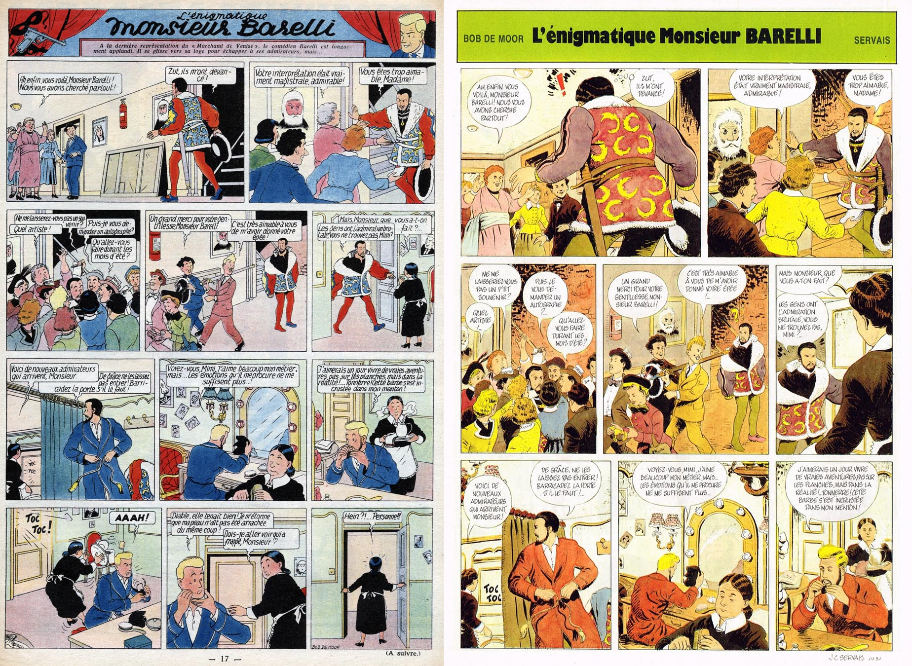
But there is no erotism in his Barelli page 🙂 . On the left you can see both the version by Bob De Moor and the one by Servais. The version Bob De Moor drew is the original one as it was published 65 years ago on page 17 of issue 31 of the Tintin journal from 1950.
Once again the number of frames and even strips has been reduced compared to the original, 8 frames compared to 11 in the original and 3 strips compared to 4 strips in the original. The reason is simple, Servais‘ version stops after frame 8 of the original version, it’s not sure why really. You will also notice that Servais has opted to keep the text completely intact.
The real difference lays in 2 frames which get a more dramatic sense due to the composition. The frames 1 and 5 both have a different composition compared to the original. The frames drawn by Servais are a lot more dramatic than the ones drawn by Bob De Moor. This effect is reached by putting the back of Barelli (in frame 1) and that of the servant (frame 5) way bigger (without the feet) than in the original. It’s our belief that Bob De Moor would also have opted for this if he had drawn those pages again in a later stage of his career.
Another difference is the colour use. Servais (or his colourist) has opted for brown, yellow and red colours throughout the page whereas blue is very present on the original page. We are trying to get hold of Servais to get some more details.