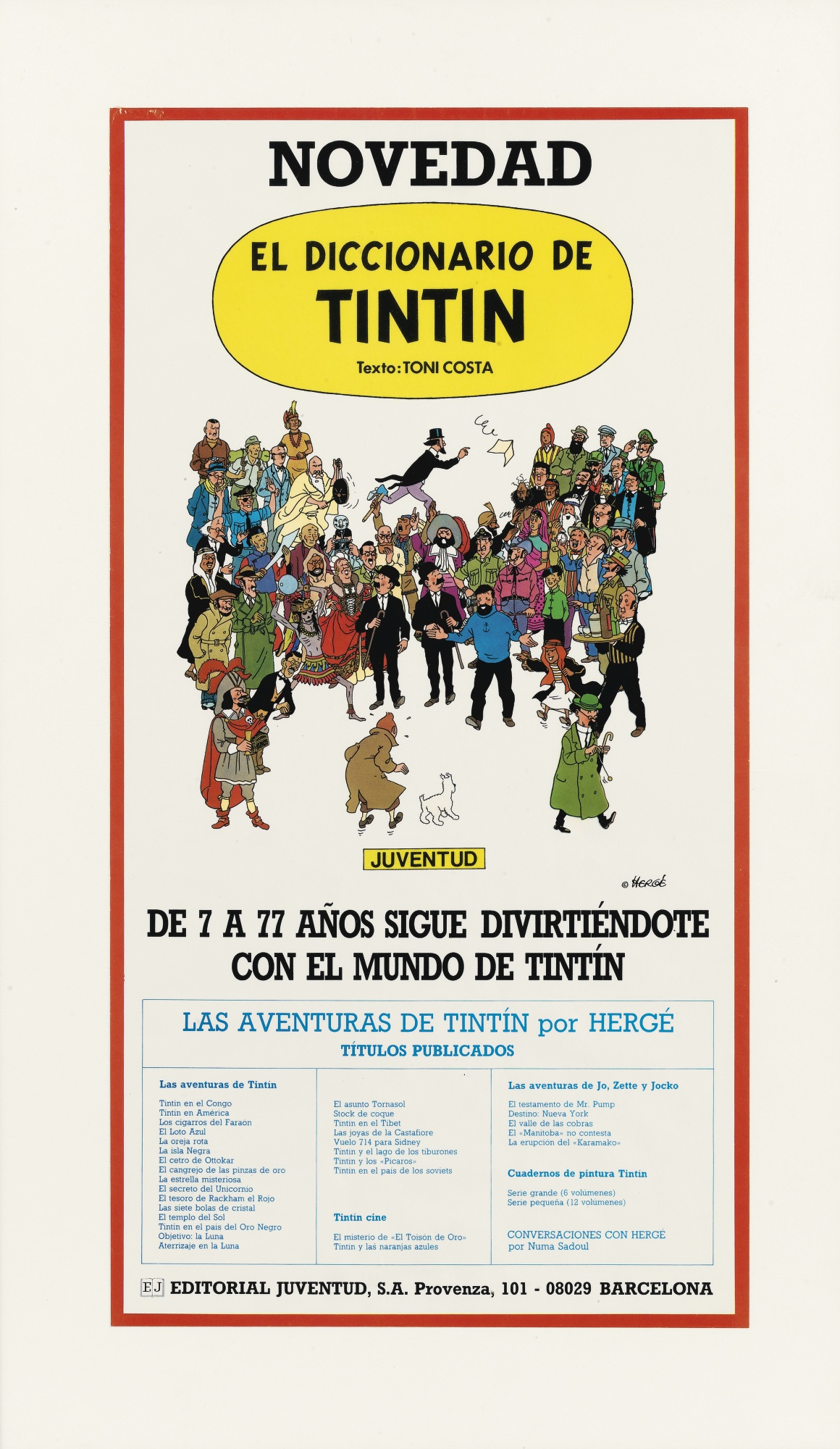
In 1986 Editorial Juventud, S.A. published the album “El diccionario de Tintín”, an 80 page counting ‘dictionary’ holding an explanation on the Tintin characters and the places they had been, in Spanish of course. The frontpage has been the talk of the Tintin town as it was auctioned via Sotheby’s where it reached a nice 20.000 Euros. But close to no one knows the real story behind who made this frontpage. One thing is sure, it wasn’t Hergé as this drawing was made after his death.
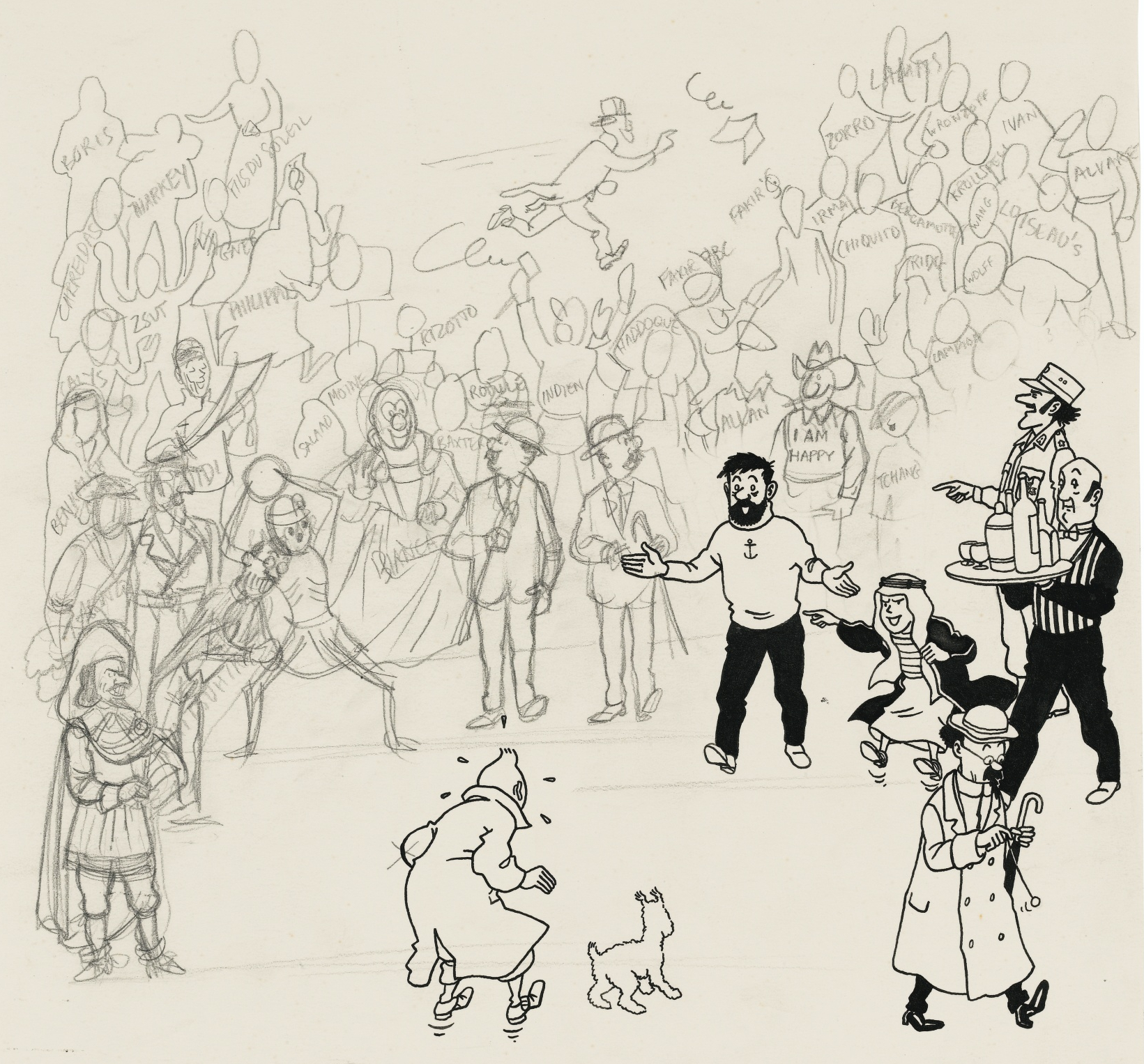
Instead, it was the work of the duo Bob De Moor and Pierre Gay at the Studios Hergé who made this design in perfect tandem style. So we decided to dig a bit in the vaults and memory of Pierre Gay to try and reconstruct how this drawing exactly came to life. The drawing was composed by Bob De Moor – he decided where all the characters had to be and made the drawing look balanced, in this case it looks like a bone for Snowy – including indications for Pierre Gay to make the actual pencil and ink drawing. The reason why Bob De Moor didn’t complete the actual drawing but limited himself to just the rough indications was that he was working on finishing the Cori album “L’Expédition Maudite”. This was one of the few exceptions as normally he was working on such a drawings.
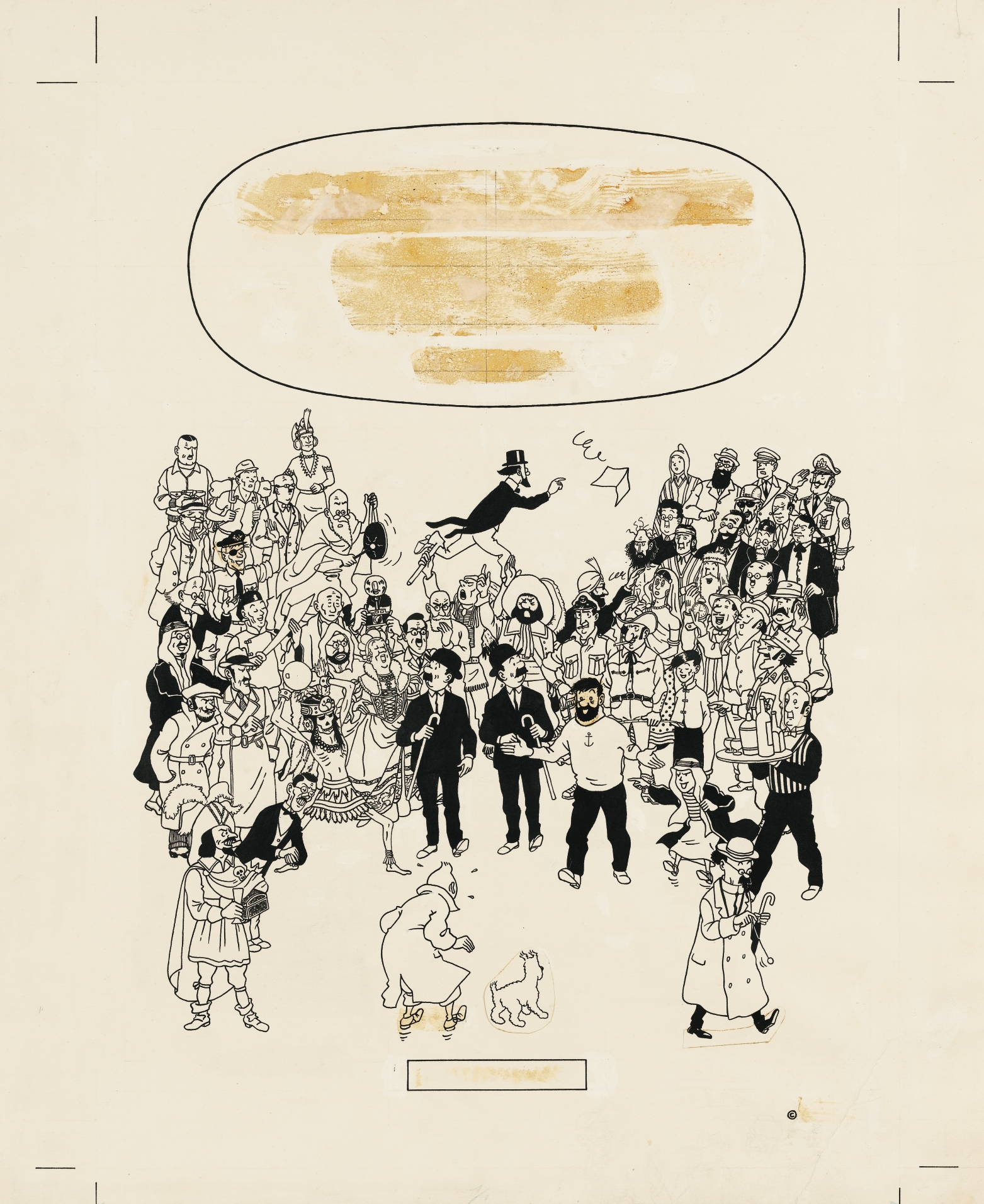
We asked Pierre Gay during a chat session last night to go over the drawing and tell us what he exactly remembered: “You can see the remark he made on the left arm of Tintin where the line I drew was a bit too thick. Bob also made me redraw twice the faces of Captain Haddock and Piotr Skut. I had pasted the final correction in ink on the first drawing of Haddock’s head, the same goes for Piotr Skut. The drawing sold via Sotheby’s is missing the final corrected images that I had glued on the paper, they were torn away. So you can actually see the faces that I wanted to hide in the first place. The same happened to the feet of Tintin. On the other hand the glued on corrections for Snowy and Professor Calculus seem to have stood the test of time a bit better as they are still present. Bob was always very nice when he wanted something corrected, he told what wasn’t ok and then explained how it could be improved. From time to time he came looking how things progressed (his office was in front of that of ours, meaning Johan De Moor, Roger Ferrari and me). He then gave me a few suggestions and then returned to continue work on Cori. It was quite a fun job to do and I was very proud that he confided in me to complete it.”
As to where all the figures were taken from Pierre Gay told us this small anecdote: “As you can notice all the characters are based on framed from existing Tintin albums. I remember having asked Bob what kind of postures the characters had to have? He answered: ‘It needs to be done quickly, so don’t bother too much with research, take the positions from the albums that you prefer. And for Philémon Siclone, take the image where he runs after the perkament, and for Rastapopoulos, check “Vol 714″.’ Those were the instructions of the chef!”
Have fun discovering the differences between the 3 images presented here. Note that the back of the very first edition of this book was missing “Las 7 bolas de cristal” in the title line-up. It was added in later editions.