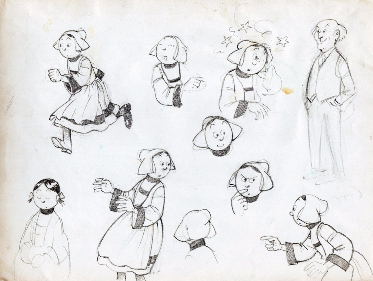
 In 1959 the Tintin Journal published the Bob De Moor story “Pirates D’eau Douce” / “De Zoetwaterpiraten” in the issues 26 till 40. The one-off story of 30 pages featured the adventures of Dic, Vic & Mic (Dik, Vik, Mik in the dutch version). On the flemish side, De Moor would see the story published in Ons Volkske (from issue 50 in 1959 till issue 28 in 1960). The story would mean the final flemish school inspired album from Bob De Moor who would from now on opt for the clear line from the Brussels school with Hergé and Jacobs being the perfect examples.
If you compare this story to the last Johan & Stéphan album (aka Oncle Zigomar) you can notice that Bob De Moor‘s style had undergone quite some influence from Hergé. The drawings are cleaner, preciser. It’s obvious that De Moor was able putting extra work into finishing the drawings as he was no longer under pressure of prepping the pages with the killing rhythm and deadlines which newspapers imposed. And you can say with certainty that this story would never have seen the light of day if it weren’t for Hergé asking him to join the studio.
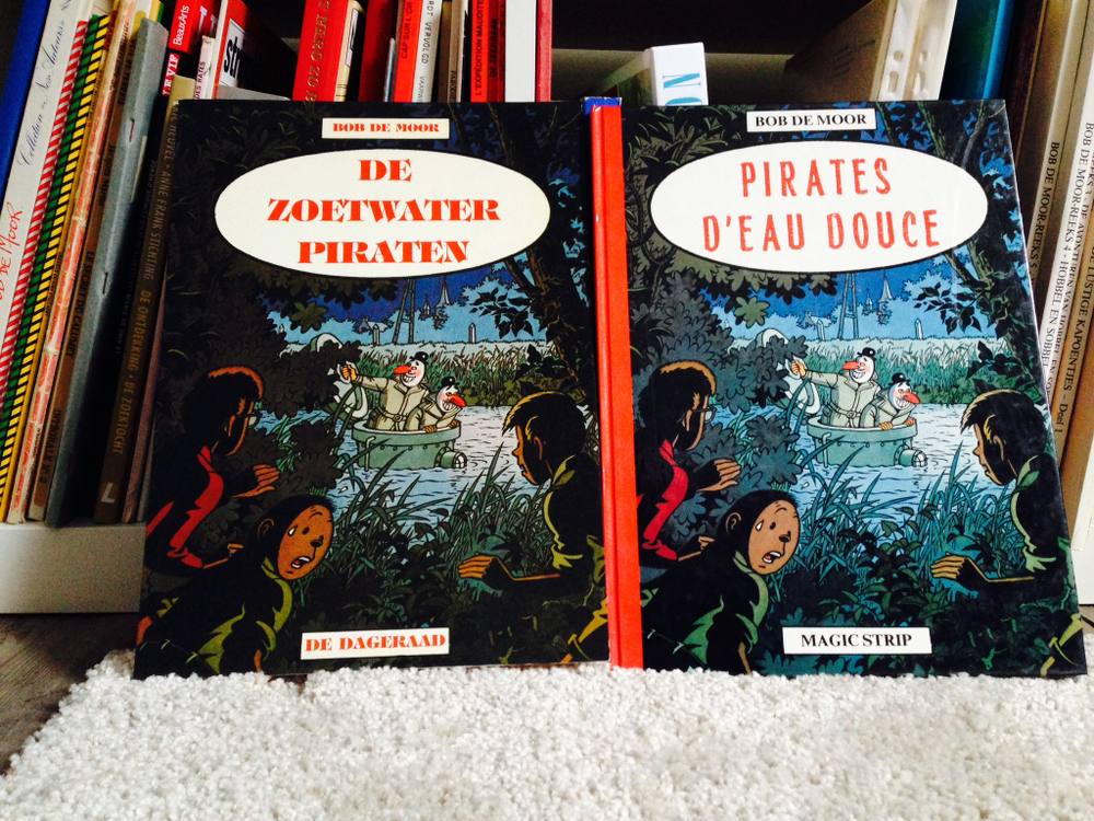
For some odd reason, it would take De Moor more than 23 years to see the story published in an album format, the fact that it only counted 30 pages is probably one of the main reasons (Le Lombard only wanted to release 44 page stories of Barelli for instance). In 1983 both Magic Strip and De Dageraad (in their Magnum series) would publish the story, with Magic Strip opting for a hardcover.
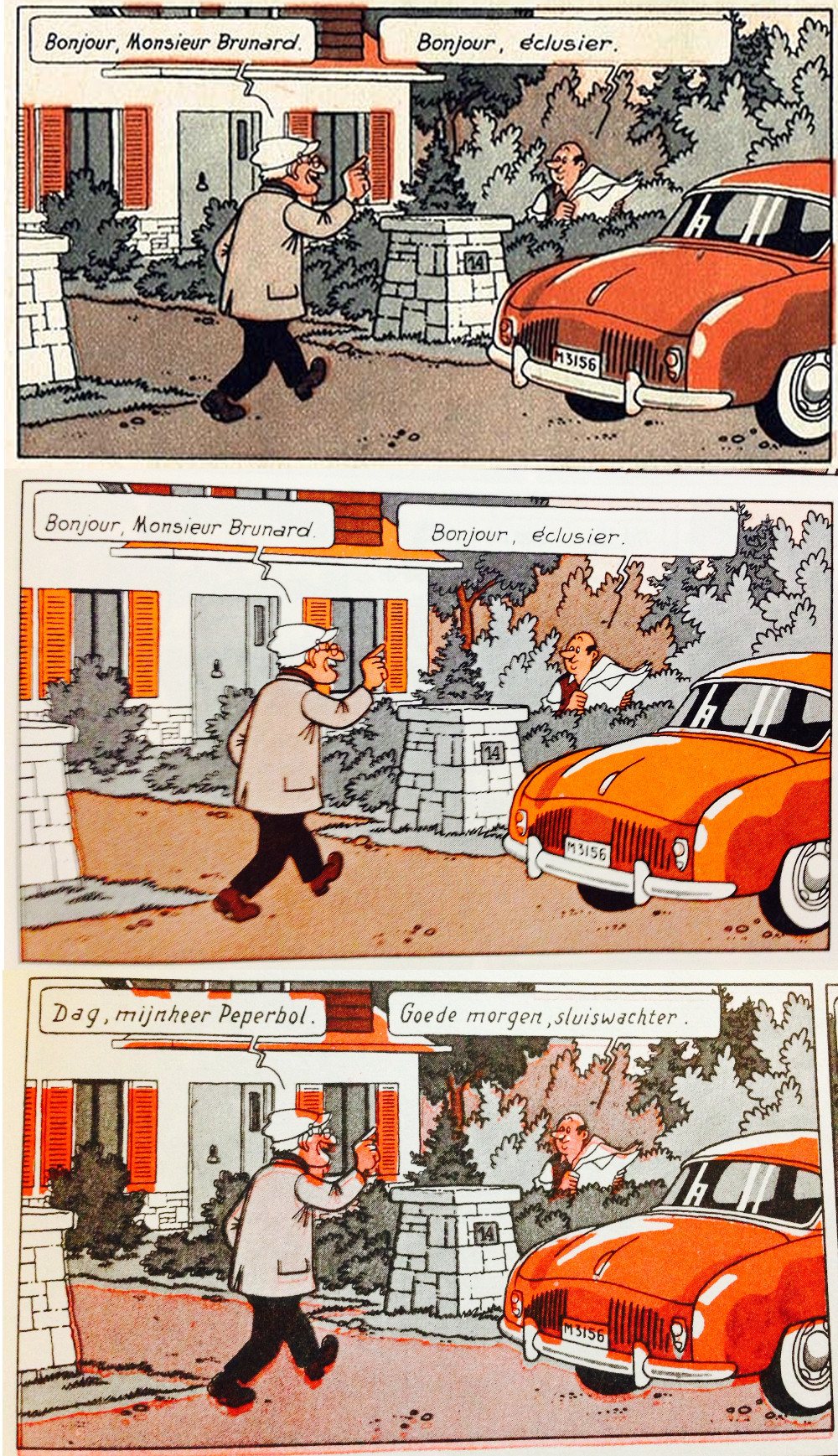
Color-wise the story suffered a lot of problems though. The coloring in the Tintin journal for instance consisted of several shades of grey and red which turned some of the details invisible especially when the darker grey was used. On top the films weren’t really matched correctly one on another, as a result the colors exited the drawings.
Also the album versions suffered the same faith, more or less. The flemish De Dageraad version got even darker ‘colors’ with another mismatch of the films (you’d think that at least one of the errors would have been avoided, but alas). The Magic Strip version had the same colors as the Tintin Journal (still too dark of course) but the colors luckily stayed inside the lines this time.
Sure thing is that this album needs a reedition with a good coloring in the style of Tintin.