
Update: We have updated the article with a comparison with the black and white version too. And guess what, there are also differences with that version too, which makes 3 different versions of one album, only one was commercially released.
A while back we talked about a black & white version of the “Tintin and the Lake of Sharks” album for which Bob de Moor actually drew the backgrounds as well.
We also talked about a colored pirated version of this black & white album which took the Flemish Het Nieuwsblad printed drawings from de Moor with the French lettering from the final released album. This pirated copy is of rather poor quality though.
However, there was an officially sanctioned colored version too which used the b&w version as basis (though not completely as the b&w 1-strip version holds more cases and a different drawing here and there as you can see below – yes, it gets complicated doesn’t it).
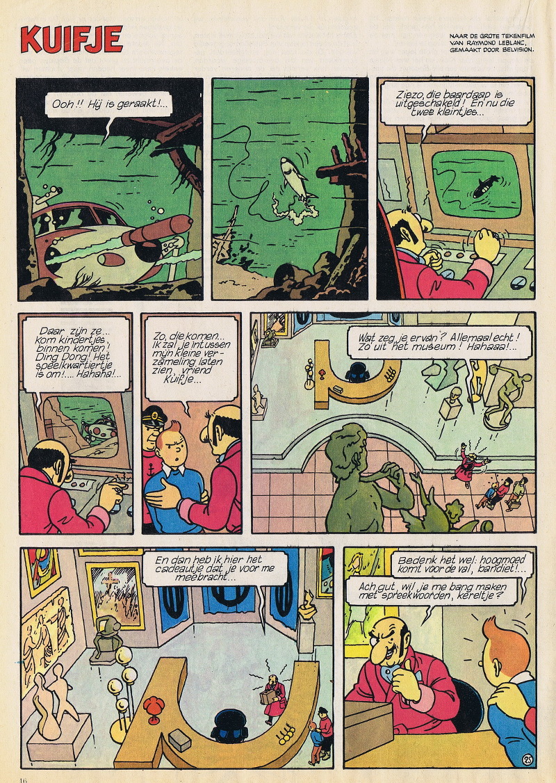
The colored official version of the entirely Bob de Moor drawn story was published in the dutch Pep magazine, issues 22 to 42, in 1973. We obtained all of the scans (thank you MS) and show you here page 25 which showcases very well the differences with the final released version and the drawings made by Bob de Moor. Notice that also the colored version sticks more or less to the colors used in the commercially available version. But there are clear differences. The same colored version also appeared in the dutch magazine Televisier later in 1974.
Now, before you continue, get that officially released album next to you and start reading below.
For those who never saw the complete version in black and white you’ll now see these differences in the decor for the first time with our comments on the colors used. And… you will also notice that the text is different to the final version too, and this latter makes us believe that the b&w version existed prior to the final version as if corrections were made afterwards. But we’ll try to get this confirmed as this is merely speculation from our side. To make things even more intriguing/complicated, the colored version we present here shows significant differences with both the b&w AND the final version.
Note that for clarity we use the case numbering of the final version:
- case 1: partially inverted background, the wooden structure holds a support on the right in this version and not on on the left like in the final version. The amphibian tank with Nushka and Niko got a red color in this colored version. The text is completely different to the final version.
- case 2: there is no house to be seen on this colored version. There is no off screen narrative in this version (but it is again available in the b&w version)
- case 3: the monitor is different, more simple in this colored version, and is horizontally aligned unlike the 10 degrees up in the final version. The text is completely different to the final version.
- case 4: the angle of the decor in case 4 is at 10 degrees down, while in the final version it is at 10 degrees up. The text is completely different to the final version.
- case 5: there is no decor in this colored version. The text is completely different to the final version.
- case 6: there is no text case 6 in this colored version (but is available in the b&w version).
- case 7: De moor added a few roman/greek statues, placed the desk in the middle and added a few other artifacts here and there. The floor is also completely different. The man holding the case with the reproducer has red hair in the final version, here it’s black. His shirt also switched to light green. The guard holding Tintin has a blue shirt in the final version, here’s it’s pinkish red, just like Rastapopoulos’ ‘bathrobe’. The text is completely different to the final version (in the b&w version the case as seen in the colored version has been truncated on the left).
- case 8: the same decor changes like in case 7 and Tintin and the guard are higher up compared to the final version. The text is completely different to the final version.
- case 9: the decor is different, the table too in this colored version. The text is completely different to the final version. Note that Rastapopoulos uses the german stopwords ‘ach gut’ in this version.
The whole album is actually full of these differences and makes it rather fun to read and compare. Note that the album cover as we know it never got published, instead there was an announcement page used as you can see on the left. Again an indication that this was an early version prior to the final one.
For your info, Pep was a dutch comic journal which was published from 1962 to 1975. It originally brought a mix of belgo-franco comics and stories from the Walt Disney portfolio. Later on there was also attention for dutch comic artists. The last issue was number 39 in 1975. The fusion of the publishers De Geïllustreerde Pers and De Spaarnestad resulted in a brand new magazine: Eppo, which later on got named Eppo Wordt Vervolgd, Sjors & Sjimmie Stripblad and Striparazzi. The magazine disappeared in 1999.